Here are a few projects I worked on at Spotify.
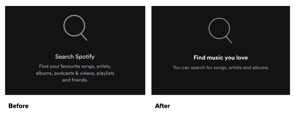
SEARCH Empty state
The original version was hard to read at a glance—it mentioned seven examples of things you could search for. In my revision, I simplified things by choosing three key examples. I also changed the title so it focuses on the benefit (finding music you love).
Spotify codes
When we first introduced Spotify Codes, I tackled the challenge of explaining the feature in as few words as possible. After trying out a few versions, we landed on this one. While the final copy wasn’t as quite as simple as I would have liked, it got the main points across—and it helped people try a fun new feature.
SKIP LIMITS
Sometimes people want use a feature in a way that isn’t supported by the product. In these cases, the trick is to be clear about the limitation, but not come across as overly negative.
One issue with the original text is that it emphasized the most negative word (“limit”). Coupled with the large type size, this came across as shouty. I suggested revising this so it conveyed the facts in a more conversational tone. Rev 2 was my recommended version, since it focused on what they user can do, rather than on what they can’t.
SPOTIFY UX WRITING
CHALLENGE
Help people find the music and content they’re into.
SOLUTION
Describe how Spotify works in simple, clear language.
HOW I HELPED
Collaborated with designers and product managers to articulate goals and align on key messages
Developed new copy for testing and participated in user research sessions
Edited existing copy for clarity and tone of voice
Team: Spotify


